Designs
Definition
With themes you can define the graphical properties of one or more guides. A design acts as a template for the appearance of a guide in the frontend.
How to assign a design to a guide is explained here.
Create new design
You can create a new design in the Dashboard under GuidePlugin > Designs > Create new design.
Colors
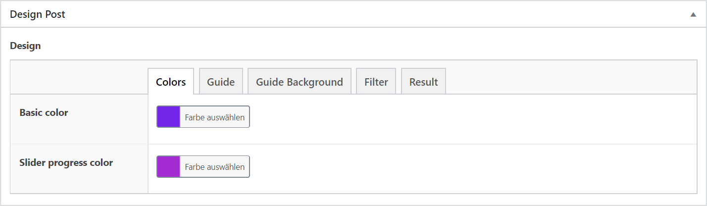
- Basic Color: The Basic Color is applied to many individual components of the guide and their respective components. It is the main color of your guide.
- Slider Process Color: This setting determines the color of the process display at the top of the filter.
Guide
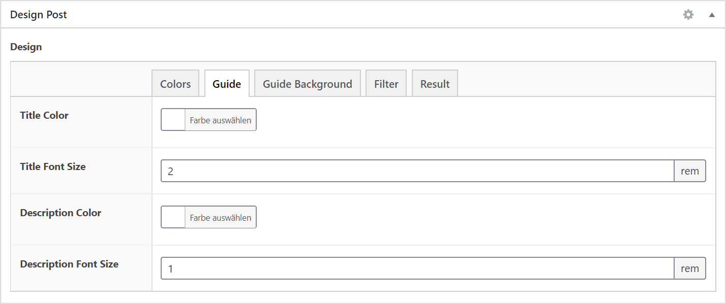
- Title Color: The color of the guide heading.
- Title Font Size: The font size of the guide heading.
- Description Color: The color of the guide description.
- Description Font Size: The font size of the guide description.
Guide Background
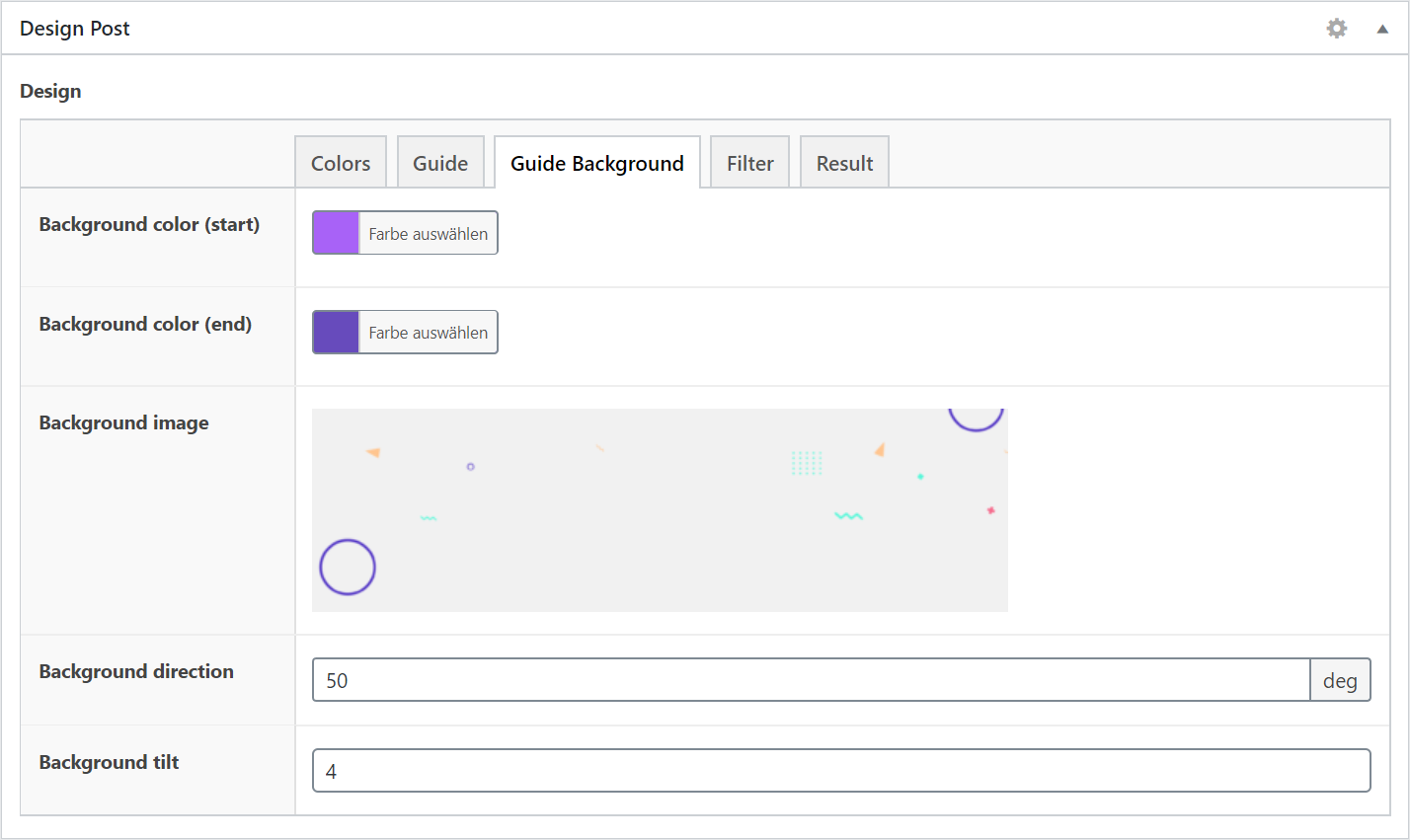
- Background Color (Start): The start color of the guide background gradient.
- Background Color (End): The final color of the guide background gradient.
- Background Image: This image is displayed above the guide background.
- Background Direction: The direction of the gradient.
- Background Tilt: The slope of the background.
Filter
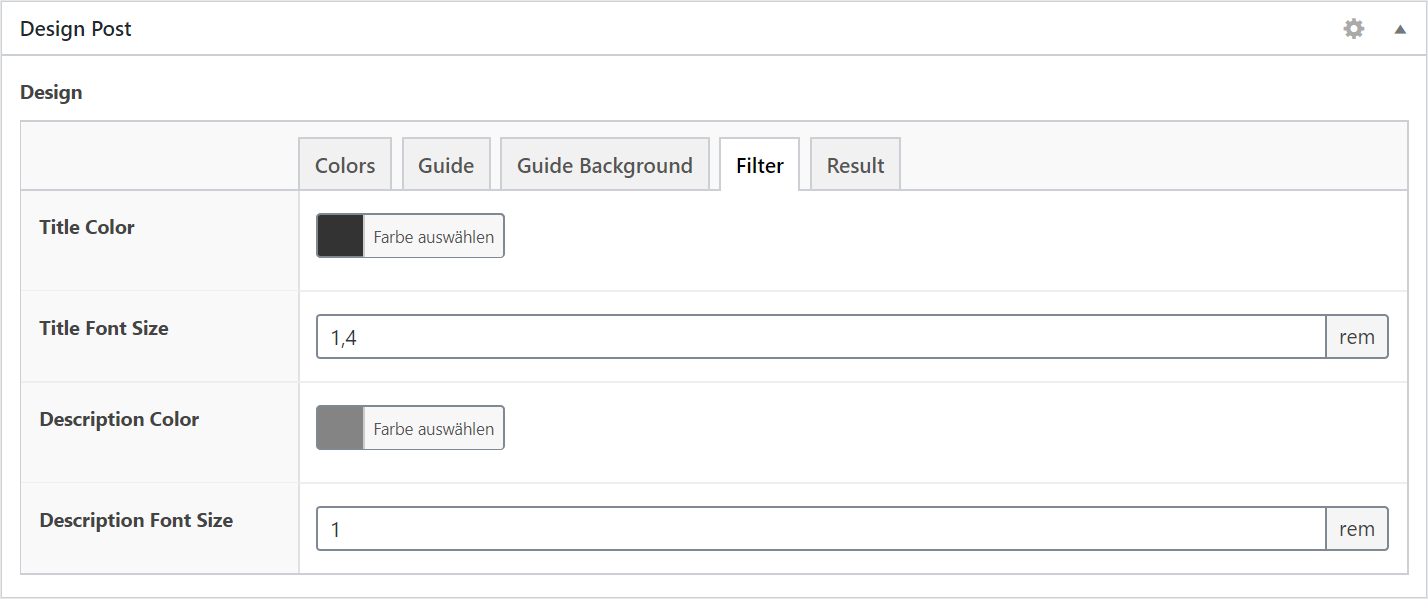
- Title Color: The color of the filter heading.
- Title Font Size: The font size of the filter heading.
- Description Color: The color of the filter description.
- Description Font Size: The font size of the filter description.
Result
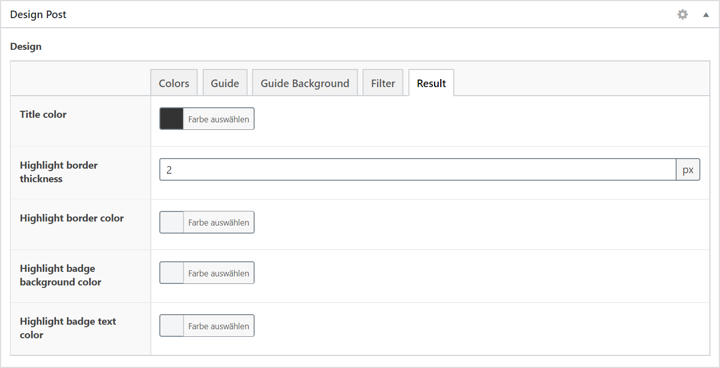
- Title Color: Font color of the result header
- Highlight Border Thickness: The frame thickness of the first result
- Highlight Border Color: The border color of the first result
- Highlight Badge Background Color: The background color of the “The perfect result” badge
- Highlight Badge Text Color: The font color of the “The perfect result” badge
 Components